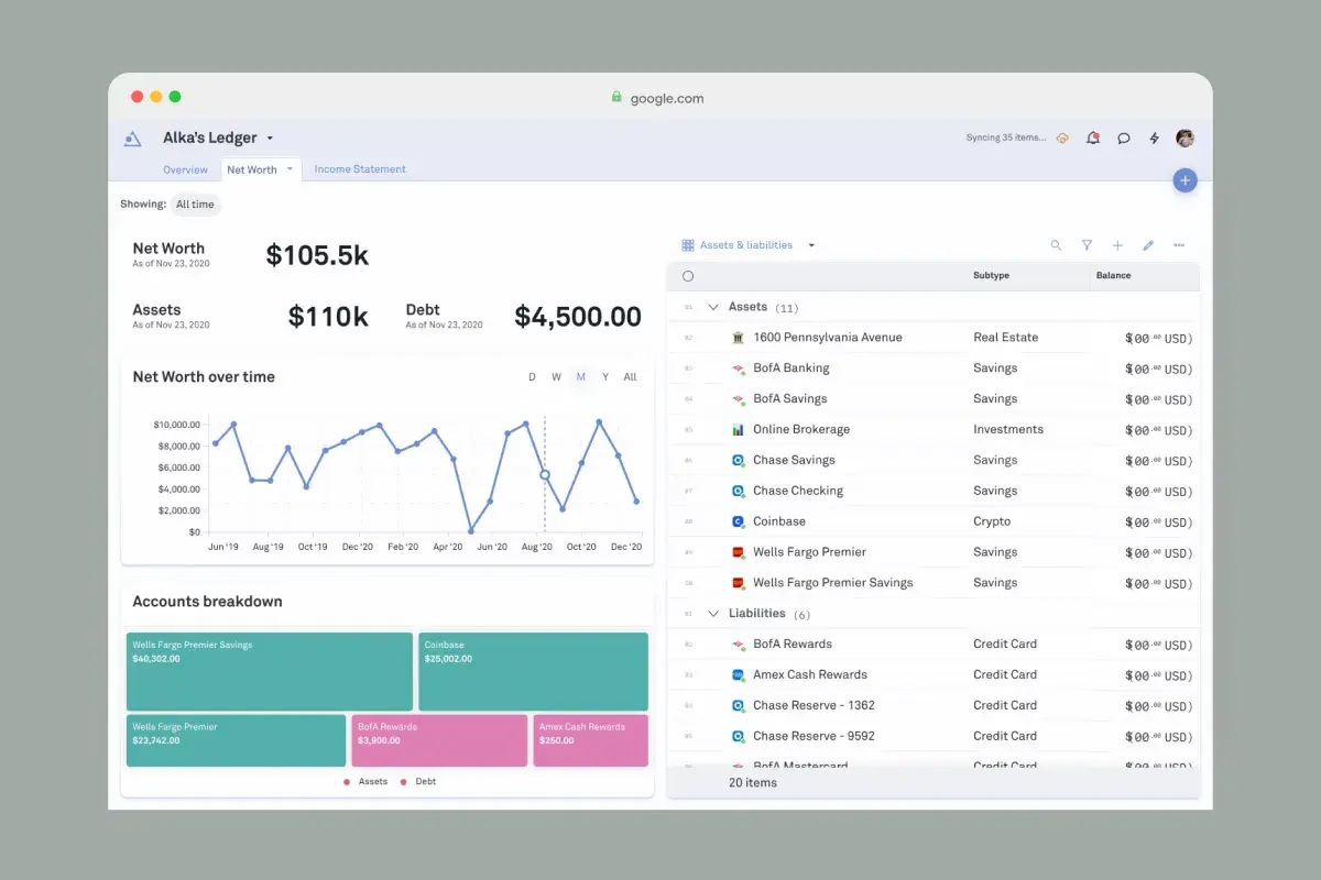
Alka
Single Product Designer for a web app that helps users keep track of all their finances in a single place.
2026
For Warna-Warna: Los Colores de Bali, I built a web experience that extends the physical exhibition beyond the gallery walls.
Each photograph in the exhibition has a corresponding spread online, where visitors can explore additional context, references, video, and sound. The result sits somewhere between a digital exhibition catalogue, a photo book, and an interactive zine.
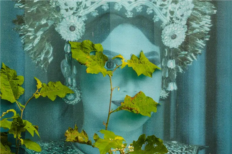
Visit the Warna-Warna web experience →
The physical exhibition brings together 31 photographs and videos from Strange Visitations. The web experience gives the work a second space to exist in, where individual photographs can be explored at their own pace and accompanied by material that couldn’t fit into the gallery.
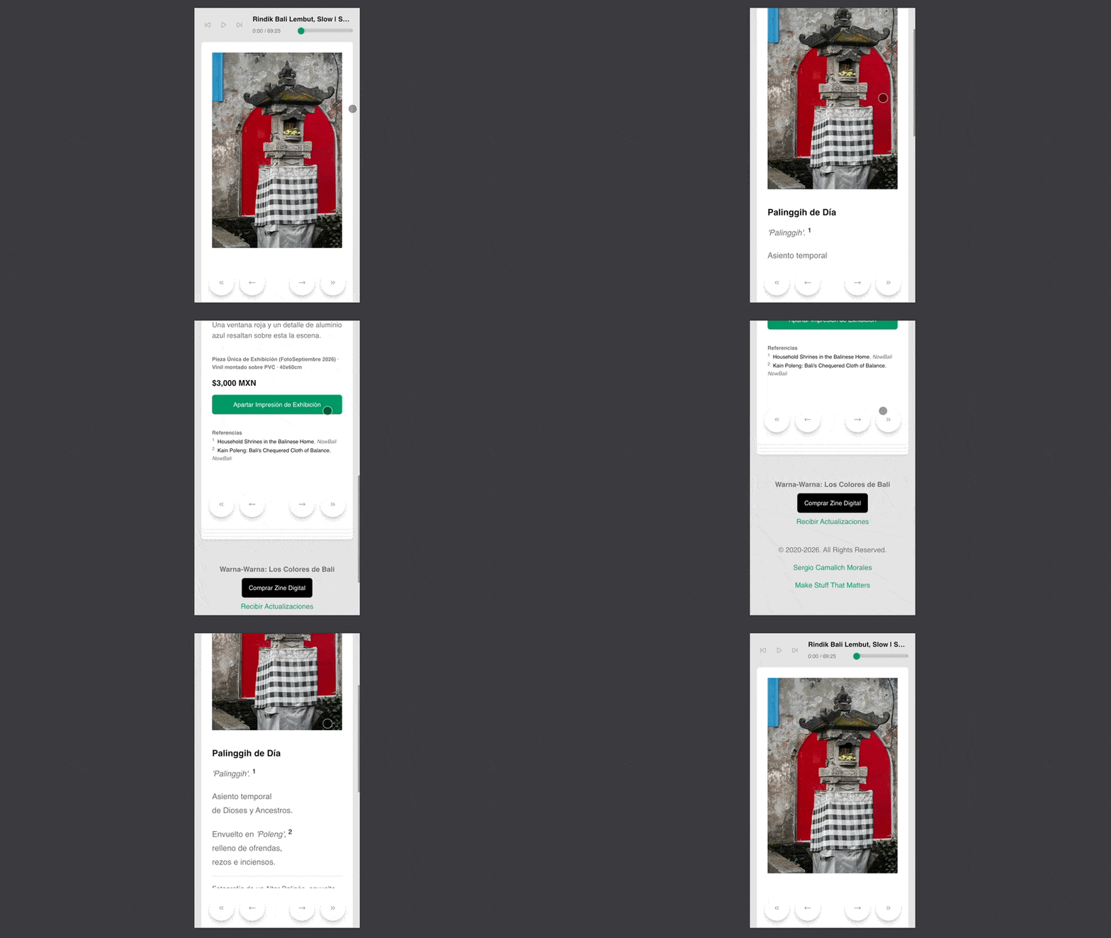
The experience includes a custom YouTube-based audio player that plays Balinese gamelan while visitors move through the spreads.
The player persists across navigation, so the audio behaves more like a soundtrack to the publication than something that belongs to an individual page.
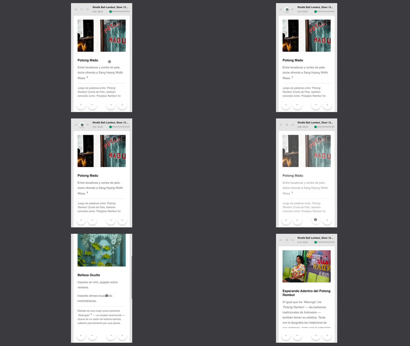
Rather than building a collection of individual photo pages, I treated the website as a digital publication.
Each piece of content belongs to a spread. A spread can contain a photograph, video, or iframe, and can use different compositions such as single- and double-page layouts.

This approach also made the editorial structure easy to change. The content itself remains independent from its position in the publication, while a separate configuration file controls the order of the spreads.
That meant I could keep experimenting with the sequence of the work without having to restructure URLs or content.
On desktop, the experience can also be navigated entirely from the keyboard. The arrow keys move between spreads, while additional keyboard shortcuts make it possible to control the experience without reaching for the mouse.
This keeps the interaction lightweight and lets the publication be explored at its own pace, more like turning through a book than navigating a conventional website.
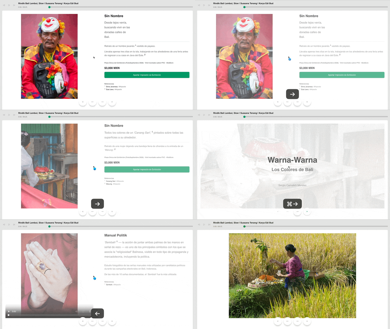
Because the spreads are structured as content rather than hard-coded pages, the same material can be used in different ways.
I built a PDF export workflow with Puppeteer that allows the web publication to also become a printable document.
This gives the project a useful relationship between screen and paper: the website isn’t simply an online version of the exhibition, and the PDF isn’t simply a screenshot of the website. They’re different ways of arranging the same underlying content.
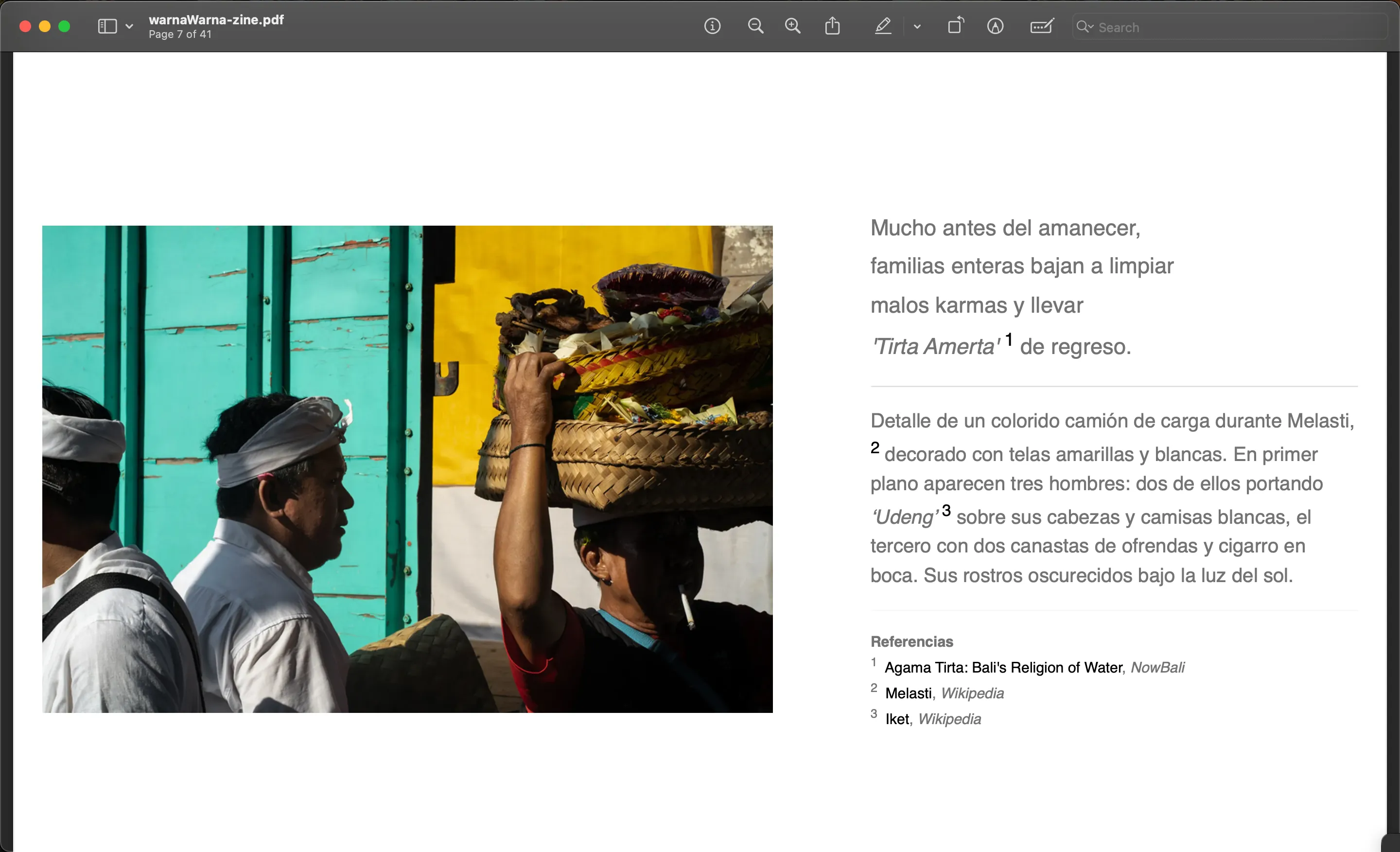
The website isn’t only a place to view the exhibition.
Individual photographs include an option to reserve a physical print, creating a direct connection between the digital experience and the photographs hanging in the gallery.
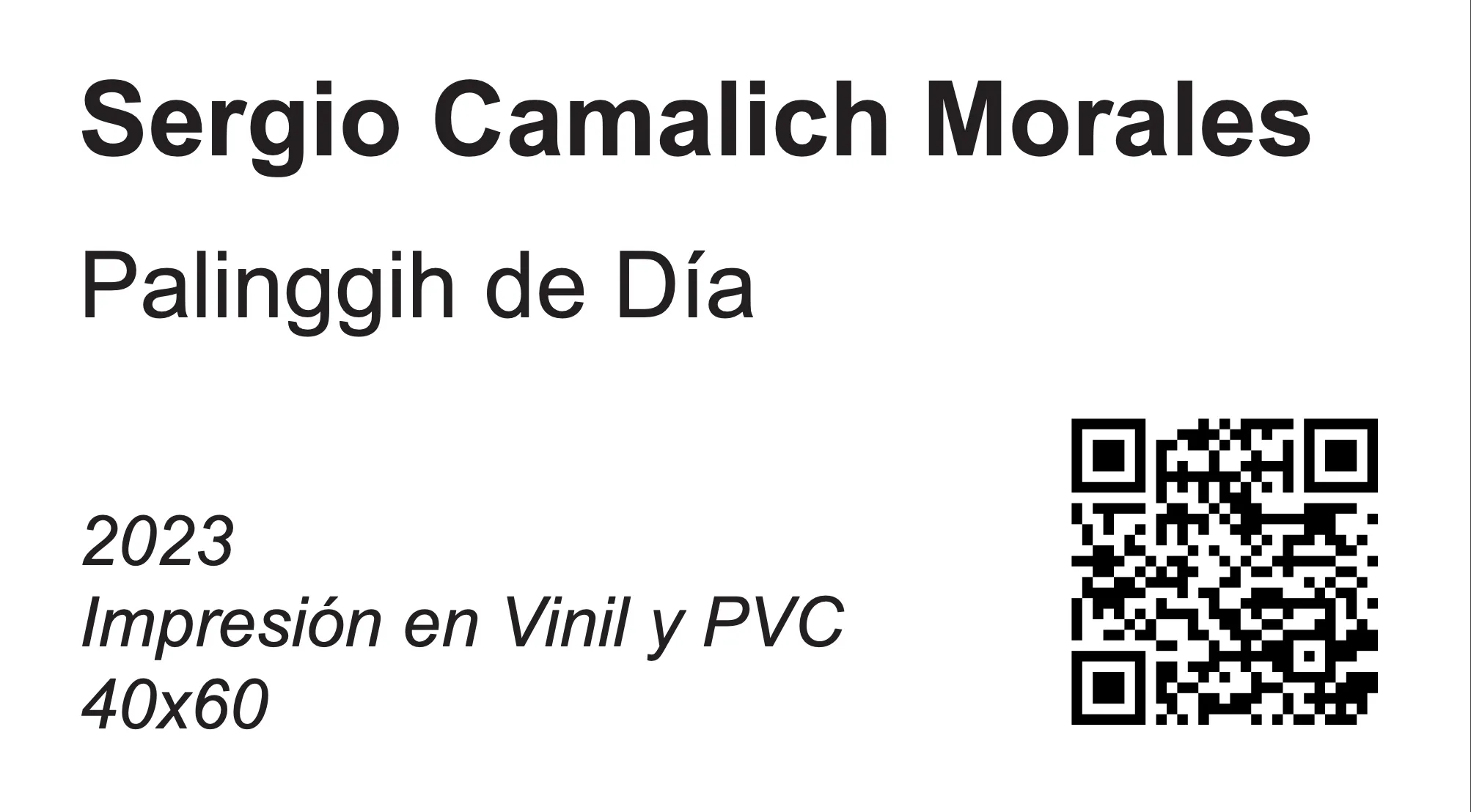
QR codes attached to the physical exhibition also lead visitors back to the corresponding spreads, where they can find additional material about the work.
The physical exhibition was necessarily limited by the gallery space. The photographs and videos could be seen on the wall, but there was little room to provide the surrounding material that gives them context: references, notes, sound, and the connections between individual photographs.
I designed and developed a custom editorial-style web experience around the idea of spreads rather than conventional web pages.
The site is built with Astro and uses a content collection to define each spread as a piece of editorial content. A spread can contain a photograph, video, or embedded content, and can use different layouts such as single- or double-page compositions. A separate configuration controls the sequence of the spreads, making it possible to experiment with the structure of the experience without tying the editorial order to URLs.
The experience also includes persistent audio using Balinese gamelan through a custom YouTube player, navigation between spreads, references and source material, and an option for visitors to reserve a physical print directly from the photographs. I also built a PDF export workflow so the same content can be assembled into a printable version.
The result is a digital layer for the exhibition that gives each photograph more room to breathe and allows the work to exist beyond the physical installation.
Instead of treating the website as documentation of the exhibition, it became another form of the work: a place where photography, sound, video, references, and editorial sequencing can come together in a format that feels closer to a digital publication than a conventional portfolio site.
I'll help you connect your vision and purpose to the people you want to reach.
Single Product Designer for a web app that helps users keep track of all their finances in a single place.
Helped shape the vision, design and execution of this international dance festival.
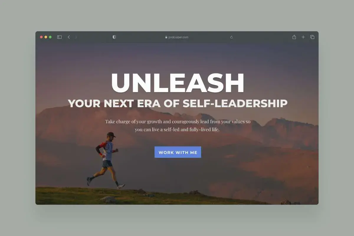
Website redesign for a self-leadership coach with over 10+ years of experience in the field of entrepreneurship and coaching.